Lunge Feeding: Infographic
5 Nov 2008
Report for the Info Visualization course for the Bentley University UX certificate.
Visualization Case Study: Lunge Feeding info graphicÂ
Background
On 11 December 2007, the New York Times Science section featured an article entitled “Fin Whale at Feeding Time: Dive Deep, Stop Short, Open Wideâ€. The accompanying information graphic entitled “ Lunge Feeding†appeared in print and web versions of the article and won a silver medal from the international Malofiej competition and two awards of excellence from the Society for News Design.
Jonathan Corum the creator of the graphic is principal of 13pt a one-person design studio specializing in information design, type design and web site development. 13pt specializes in the visual explanation of complex information. His web site 13pt.com sites him as the current science graphics designer at the New York Times.
Appearance
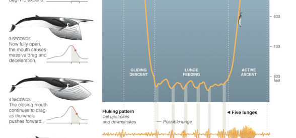
The image at left shows how the graphic appeared in the print version of the New York Times.
A larger version follows on the next page.
Nature of the Audience
The article and accompanying graphic appeared in one of the largest daily newspapers in the country. Readers may differ in many ways including:
- Interest in the topic – will the reader take in the whole article or if he is only mildly interested scan for important aspects of the article?
- Time available – are there time constraints on the reader that may require a quick read leaving little time to delve deeper?
- Attentiveness – are they reading at home or office or are they in a subway or restaurant? Attention is roughly a fixed quantity. The more a person focuses on one task the less attentive they are to other tasks.
As newspaper stories contain the important information early in the article counting on the fact that many fail to completely read a full article, the information graphic attempts to convey complex information quickly. If a reader chooses, they may spend more time on the graphic to delve deeper into the layers of information.
Nature of the Information
“Lunge Feeding†presents information as a mixture of diagrams, illustrations, line charts and text. The graphic invites reading at several levels – perfect for readers of a daily newspaper who may have various levels of interest in the subject.
The information graphic consists of two columns defined by the use of white space. Good segmentation results through the use of space and alignment. The left edge of the main diagram creates a natural border between columns.
The left column contains the main title accompanied by a short paragraph introducing the graphic.
Extending below the main title and text are illustrations of a fin whale outlining the shape during the lunge and graphically showing speed vs time over the 6-second lunge duration. The illustration is not cartoonish and provides a level of detail that the reader can study (opening of the mouth, blubber between lower jaws) Accompanying each illustration is a line chart displaying speed vs time over the six-second course of a lunge. A dot on the line chart clearly relates the whale’s shape and its position in time during the lunge.
Just below the main title and paragraph and above the series of fin whale illustrations is a small line to show scale (10 feet). The placement of this line is such that not only does it clearly show that the length relates to the whale illustration, it also acts to subtly section the left column into 2 parts: the main title and text and the illustrations.
The use of proximity and white space create five distinct groups of information, each representing a snapshot in the time of the lunge. Each group consists of a whale illustration, lunge speed line chart and text relating the illustration to the line chart.
The right column contains the main diagram with accompanying text titled “An Energetic Dive for Foodâ€. The diagram traces the gliding descent, lunge feeding and active ascent with respect to time on the horizontal axis and by depth on the vertical. Two illustrations of the fin whale, one during the descent and the other during the ascent, help the reader to compare the length of the whale to the depth of the dive.
Two line charts are placed just below the main diagram entitled “Fluking pattern†and “Speed†Using the Gestalt principle of connectedness, vertical grey lines are a powerful way to tie the fluking pattern and speed line charts to the whale path in the main diagram.
The fluking pattern line chart shows the tail upstrokes and downstrokes: areas above the horizontal are upstrokes, area below, downstrokes. The vertical axis does not clearly identify a unit of measure (though as we will see below the color indicates a length). The horizontal axis is time. It’s clear from the chart that the whale expends energy with its tail leading into the lunge followed by a great effort during the active ascent.
The speed line chart clearly illustrates how quickly (at times greater than 10 miles per hour) the whale descends with little effort (minimal tail strokes). Speed during each lunge is clearly shown and matched to corresponding tail upstrokes and downstrokes as well as slight ascents). Finally, the active ascent is directly shown to be the greatest expenditure of effort.
How this Graphic Succeeds
All text and graphics are simple and succinct. There is no superfluous eye candy. Even whale illustrations though pleasing to look at convey information.
The use of a fairly detailed illustration to show the shape of the fin whale coupled with the proximity of the lunge speed line chart show causality: the effect of whale shape on the speed. As the whale opens its mouth increasing its cross sectional area and increasing drag, the speed decreases.
The multiple instances of whale illustrations elicit direct comparisons. They represent and narrate sequences of motions (Tufte 1997).
Color is used purposefully and quickly shows data is different without having to read.
Amber is used to show distance or length in line charts for the path of the whale and the tail upstrokes and downstrokes. Burnt orange is used to indicate speed as seen on the lunge line charts accompanying each whale illustration and the speed line chart under the main diagram.
The information graphic provides sources (creator Jonathan Corum, Illustrator Nicholas D. Pyenson, Journal of Experimental Biology, Marine Biology Progress Series) to lend credibility.
“Lunge Feeding†is successful because it “enhances the ability of the reader to understand and remember information because of how well information is presentedâ€. (Tufte)
References
Information Visualization, Colin Ware 2004
Visual Display of Quantitative Information, Edward R. Tufte 2001
Envisioning Information, Edward R. Tufte 1990.